10 Outstanding Benefits of Responsive Web Design
Imagine buying a TV that only shows black-and-white visuals in today’s hyper-digital age. Sounds ridiculous. Similarly, a non-responsive website is like an outdated TV in the world of colorful, HD-ready internet. Perhaps that’s a tad dramatic, but there’s some truth to it!
Let’s delve deep into the wonders of responsive web design (RWD) and how it’s proving to be the unsung hero of the online cosmos.
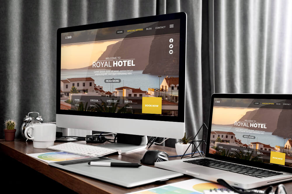
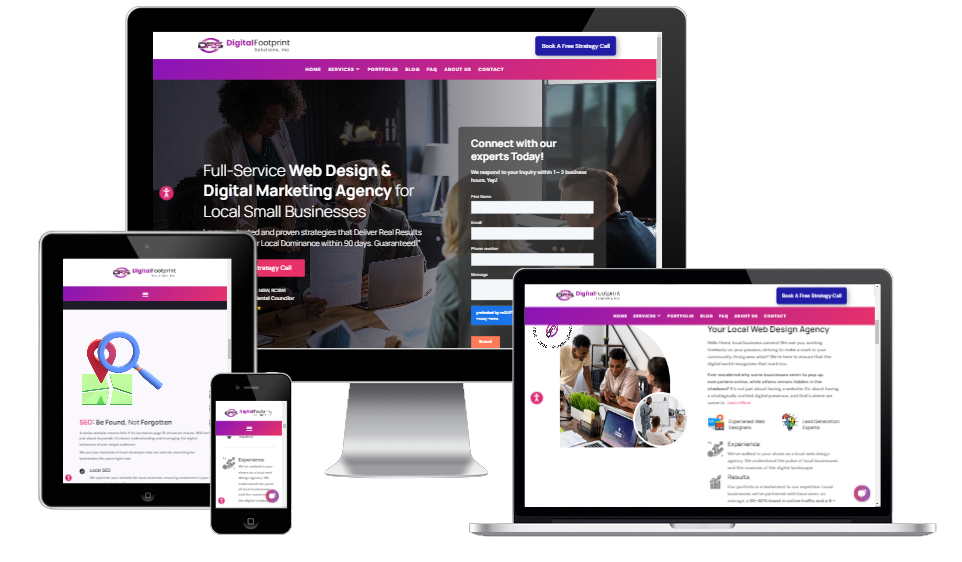
Enhanced User Experience Picture this: you’re on your phone, checking out a website about… let’s say, humorous cats (because who doesn’t love those?). The problem?
The site’s so zoomed out that the cats look like ants. A tragedy indeed! Responsive design ensures that whether you’re on a desktop, tablet, or phone, those cats (or any content) are displayed purr-fectly.
- Real-life example: Remember when you had to pinch and zoom a website on your phone continuously? Annoying. Responsive design eliminates that ancient struggle, giving users a seamless experience across devices.
1. Improved Search Engine Ranking
Google loves a responsive web design website. Seriously, they’re like two peas in a pod. Google favors mobile-friendly websites and gives them a higher ranking in search results. And since responsive design is about being mobile-friendly, it’s a match made in digital heaven!
- Real-life example: Have you ever heard of the mobile-first indexing update by Google? It prioritizes mobile versions of websites in search rankings. So, with a responsive design, you’re already ahead of the game.
2. Cost and time-effective
Developing multiple sites for different devices sounds as tedious as watching paint dry (and twice as expensive). With responsive web design, you design once and display it everywhere. It’s like getting a buy-one-get-one-free deal in the web development world!
- Real-life example: Think about two stores – one that sells individual components of a sandwich and another that offers a ready-to-eat one. RWD is like the latter – a complete, ready-to-go solution that saves time and money.
3. Increase in Mobile Traffic
With everyone and their grandma owning a smartphone, mobile traffic is booming! By adopting RWD, you’re essentially rolling out the red carpet for many internet users.
- Real-life example: Have you ever tried accessing a non-responsive site on your phone during a commute? Nightmare, right? Now imagine a fluid site experience on the go. That’s the beauty of RWD.
5. Lower Bounce Rates
A non-responsive site is like an unwelcome party guest – people can’t wait to see it leave. A site optimized for all devices ensures users stick around, decreasing the dreaded bounce rate.
- Real-life example: Remember when a site took ages to load or looked wonky on your device? You probably left in seconds. A responsive web design site ensures that doesn’t happen to your visitors.
6. Easier Analytics Reporting
Tracking user journeys and site traffic becomes a piece of cake (Mmm… cake) with RWD. Tools like Google Analytics are optimized for responsive sites, allowing for a more streamlined analytics approach.
- Real-life example: Imagine trying to understand a report written in a mix of 5 languages. A headache, right? Non-responsive analytics can feel the same. With RWD, it’s like reading your favorite book – straightforward and enjoyable.
7. Boosted Social Sharing
Responsive design plays nicely with social media buttons. This means more shares, exposure, and more viral cat videos. Win-win!
- Real-life example: Remember when you wanted to share an adorable puppy video but couldn’t because the site was all over? With RWD, sharing becomes a breeze.
8. Improved Online Browsing Experience
Fluid grids, flexible images, and media queries – the golden trio of RWD – ensure an impeccable online experience. It’s like going from riding a tricycle to a luxury car.
- Real-life example: Recollect a time when images on a site overlapped text or buttons were too tiny to tap. RWD fixes those pet peeves, offering a plush browsing experience.
9. No Need for Redirection
Say goodbye to those pesky “Visit our mobile site” prompts. One size fits all, eliminating the need for multiple versions and tedious redirects.
- Real-life example: It’s akin to walking directly into your favorite store versus being redirected to three others before you find what you want. Efficiency at its finest!
10. Future Scalability
Last but not least, a responsive wed design ensures your site is future-proof. Your site will be ready as new devices emerge (who knows, fridge browsing may be the next big thing!).
- Real-life example: Imagine investing in a gadget only to find it obsolete in a year. RWD is like a timeless piece of tech – always in vogue, regardless of device trends.
Conclusion
In the grand theatre of the internet, responsive web design is the superstar performer, never missing a beat. It’s the one-stop solution for businesses looking to provide an unparalleled online experience to users across the spectrum of devices.
So, if you’re still contemplating the shift to RWD, remember – the internet might not wait, but your competitors will gladly zoom ahead! Get in touch with a expert member of our team today
FAQs
Q: What exactly is Responsive Web Design (RWD)?
A: RWD is a design approach where a website is built to provide an optimal viewing experience across various devices, from desktops to mobile phones. In simpler terms, it’s like a chameleon adapting to its environment – a site adjusts based on your device.
Q: Why is Google so keen on mobile-friendly sites?
A: As mobile users have skyrocketed, Google aims to provide the best user experience. Sites optimized for mobile ensure that users get relevant and readable content without fuss, aligning with Google’s mission.
Q: Can I convert my existing site to a responsive one?
A: Absolutely! While it might require some tweaks and redesigns, most sites can be transformed into responsive masterpieces. Think of it as giving your site a fancy makeover – out with the old, in with the new, and improved!
And for a chuckle, if websites were outfits, a non-responsive design would be like wearing winter boots to the beach. It’s not quite fitting. Embrace RWD and let your site strut its stuff in style! Cheers to a responsive future! 🍻
Ready To Increase Your Online Visibility?
Don’t miss out on potential clients. Reach out to us now and let’s explore how we can collaborate effectively.